
Photo credited to colourlovers.com/blog
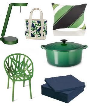
Colourlovers.com is so successful because of its creative way of looking at things. They recently did a post on the "timeless" trend in interior design of using blue & greens (specifically kelly green and navy), which they describe as a preppy combination. I totally agree. When I look at the colors together, they do appear reminiscent of Polo and Lacoste clothing. And while that's not my style forte, I do appreciate the look's clean presentation. SO! In terms of design, kelly green, blue, and white, used in unison, can produce a very neat layout.
Key word: can. But, not always... and that's not a bad thing. After all, just as most things in life, blue, green and white can also get a little wild and unpredictable.


Photo credited to WaryMeyers.com
In this particular room, (which I find to be visually stimulating and ideal for my future homestead), the teal-blue wall and green couch work to bring balance to an extremely eclectic room. The underlying lesson here is that you can make chaos work, as long as you balance the amounts in an effective way. The large blocks of blue/green color pull together the mass amounts of activity found in the artwork and throw pillows.
(Other unique room designs, with a ton of cool palettes, can be found here. It's a personal interior design site of a few people who love to take creative chances with color and patterns. Oh, and beware... there are some pretty awful designs too, where controlled chaos turns not-so-controlled.)
How do I apply this to journalistic design? This room inspires me to take chances. A lot of times, I design with the fear of going overboard--of doing something too abstract. Instead, I should trust my instincts on colors and patterns. After all, going too clean and controlled gets boring if done too often, or done when not appropriate.
No comments:
Post a Comment