
The process of deciding what to do for the cover was an interesting one... to say the least. There were too many ideas running through my head, which resulted in me stalking my roommates. I forced them to play a game with me: to say the first five things they thought of when they thought of Spring. I thought this was a brilliant idea -- that this would at least narrow down my ideas to a single concept. No. Instead, I got:
- Bunnies
- Rainbows
- St. Patrick's Day
- Bunnies
- Easter
- Family
- Bunnies
Back at square one, I wrote down a list of everything running through my head (no bunnies), and the most reoccurring theme was "April showers bring May flowers." And, about an hour later, the rain somehow turned into blue stripes met by white dots as the drops, and the flowers turned into loose swirls made by using the brush tool in illustrator.
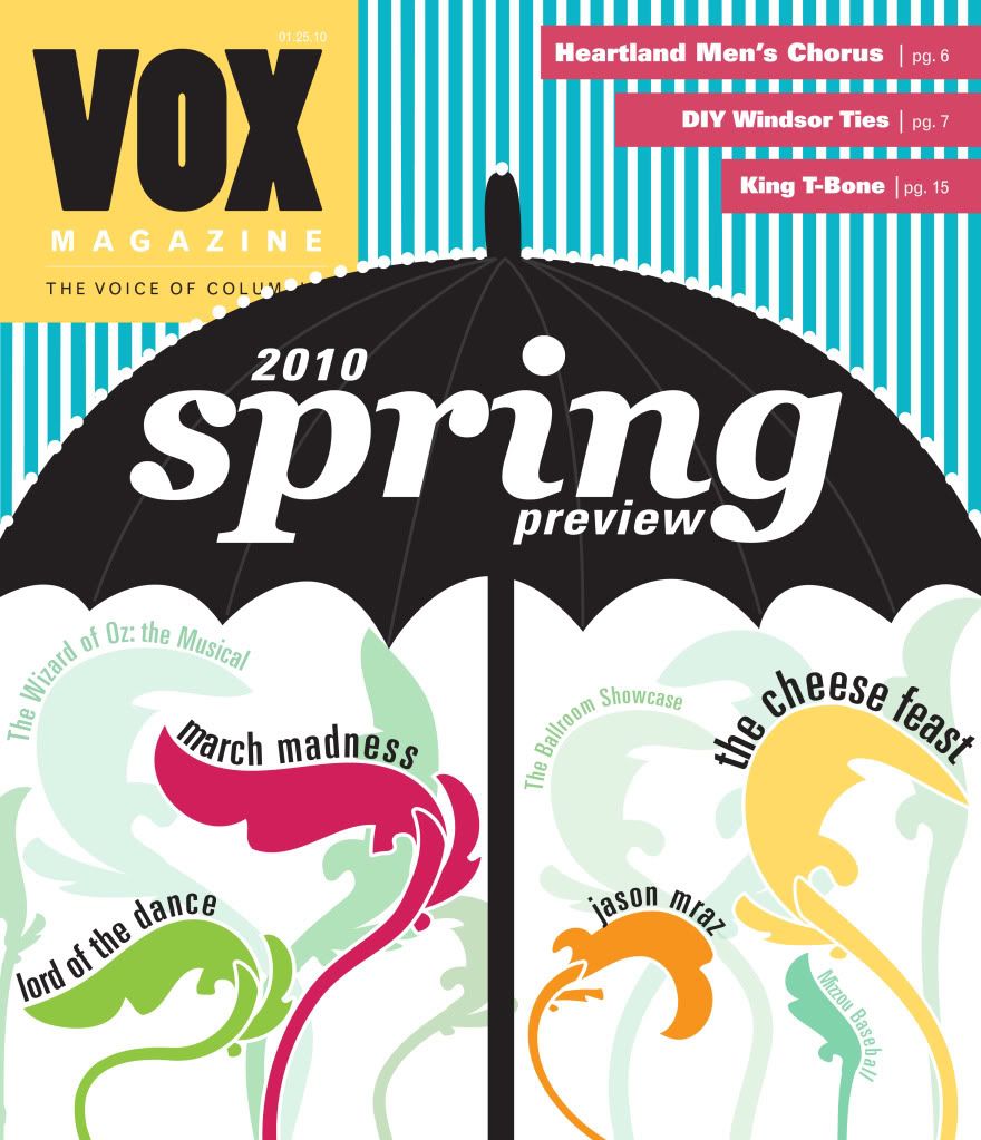
I was really happy with the way it turned out, and I later found out that it was actually picked to be published! This really surprised me after I had seen my classmates' designs - the other girls are so creative and talented, and I fell in love with some of their designs (especially Lauren's tree, Erica's wildflowers and Jessi's groundhog.)
Anyway, I spent last weekend making some edits to the cover (the final product looks a bit different than what is shown), and it will be on stands tomorrow. In reflection, it was all such a cool, yet very unexpected, experience, and I really appreciate everybody's support.
As for my feature, I wanted to use the flower colors to separate each month's activities. I used the same color palette and this is what it ended up looking like:
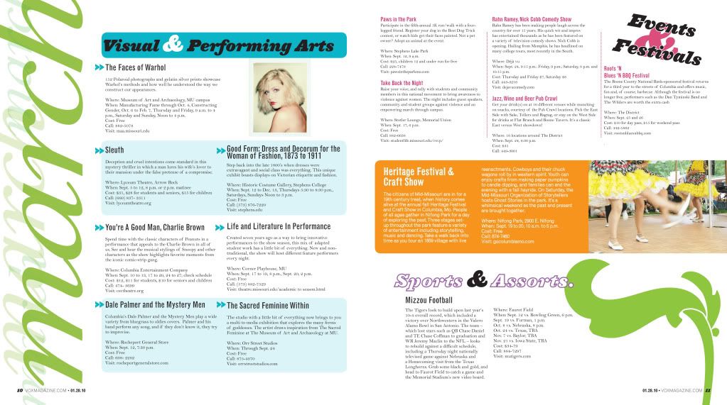
The feature was not pick to be printed with my cover...and for good reason. It is a bit boxy on the left page, and I've really got to remember that too big of text never looks as good printed as it does on screen. By making the text smaller, I could have used more photos, which would have made some of the events more recognizable.
That's all for now! Be back soon,
- Cassie
No comments:
Post a Comment