4.28.2010

You Cannot Miss This: Dontclick.it

Okay, so apparently I'm a sucker for gimmicks.

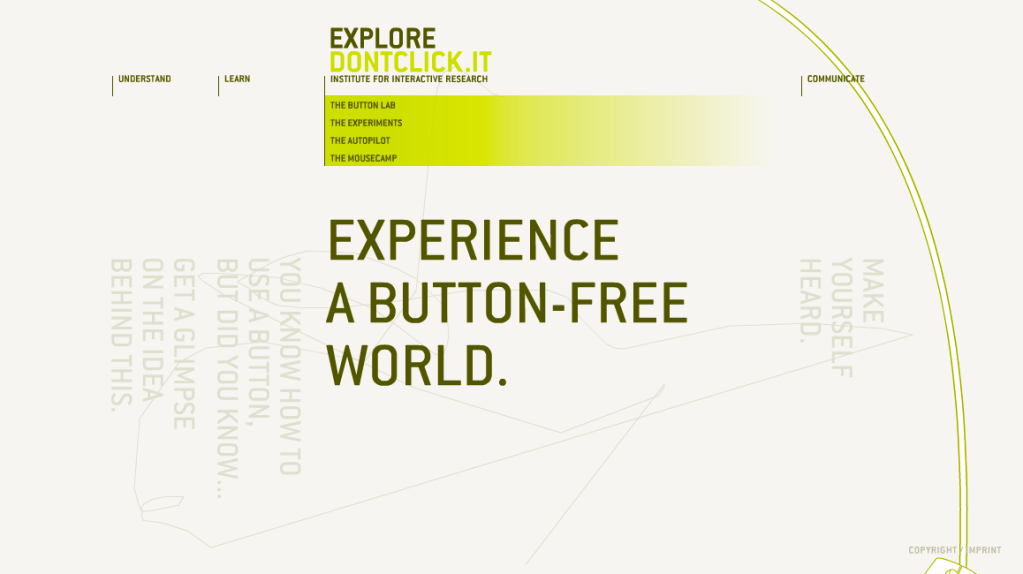
Earlier today, whilst browsing the web for something that my peers and I just had to know about, I ran into this pretty cool website.  It's called dontclick.it, and it literally revolves around the notion that you (the user) are not allowed to click your mouse. Well, except for in the very beginning.


Anyway, in the spirit of learning to create websites, I found this to be extremely appropriate. To their credit, the site is extremely interactive, engaging, and pretty entertaining despite the fact that you're really not doing anything at all except rolling over text. That said, me being the new web coder/aficionado that I am (ish...), I do think that because the site only deals with rollovers, it's a bit too confusing and easy to get trapped in areas of the page that you don't want to be in.

Still, I think it's definitely worth checking out... I appreciate the randomness and willingness to try (and develop) new ways of living.

Take care, and happy rolling!

http://www.dontclick.it <--- link. go now :)

- Cassie

4.21.2010

Critique: Web work

Aside from all of the work we're all doing on our Meredith prototypes, we're also working vigorously on our portfolio websites.  Most of us have only working knowledge of html coding, let alone how to fully articulate ourselves as designers for the rest of the world to see.  Getting all of our work online and presenting ourselves in the way we want to be perceived is extremely daunting, which also means that the perfectionist side of me has been out full-force.

Here are a few snippets of my work in progress, (emphasis on the work in progress part):
* image of my home screen


* image of my "about me" page (same template that the other pages follow)

Yesterday's class time was actually spent critiquing our classmates' sites, which I found to be very helpful. I plan to rethink the navigation, as well as the presence of the bar running across the top. Once I make those small changes, and actually get images in place, I think my website will do a really good job at representing me.

I plan to have my website up and running over the next couple of days, and when it is, I'll be sure to post the link for you all to check it out!

Until then,
Cassie

In Response To: SSND contest

A couple of weeks ago, I entered two of my design pieces in the College News Design Contest. To my surprise (you have no idea), I actually won 1st place for the "Cover of a magazine or newspaper special section" category with my Spring Preview design.

Originally published as the cover for the 2/4 issue of Vox, I wanted the cover to represent the magazine in a playful way, while also integrating a little bit of sass and staying true to my personality. While creating it, I was driven by the concept of the old saying "April showers bring May flowers," which is represented in the blue stripes (as rain), umbrella and new growth (flowers).  A lot of work was done in finalizing the design, and the revisions made on the original draft definitely helped elevate it to where it needed to be.  (Thanks Aimee!!)

Overall, aside from still being shocked by the decision, I am incredibly grateful for the recognition.

- Cassie

You Cannot Miss This: Petri dish art

Today, while aimlessly browsing one of my favorite design blogs colourlovers.com, I found a great post about petri dish art.

I've never been much of a science kind-of-girl, but had my lab classes involved these dishes, I may have actually enjoyed them (and gotten a better grade.)

A large part of why I am in design in the first place is because of my appreciation for the art.  I am driven by our ability, as designers, to beautify the world - even if only in the smallest of ways.  Klari Reis, the artist responsible for these beautiful art pieces, does an incredible job at making something that is normally overlooked, noticeable (to say the least.)

To summarize the original article, which can be found here, Reis hand paints plexiglass petri dishes and uses careful techniques in order to most accurately represent what is typically seen when looking through a microscope.

If nothing else, Reis reinforces the concept of thinking outside of the box, and serves as yet another reminder that all ideas can be made into beautiful ideas and to never, never discard any of them.

- Cassie

All photos credited to Klari Reis

4.14.2010

You Cannot Miss This: Creative advertising

After my hour long search for something inspiring, I found the incredible: creative advertising at its best.
These ads, which I randomly found at eatnineghost.com, are not only fun to look at, but definitely support my yearning to expand out of the box. Nothing about these ads is average or expected.  Sure for some, the thought may have crossed their mind once or twice, but was more than likely quickly dismissed for being too "out there." (Aka, playing it safe.)
And the designs are "out there," but that's what makes them so cool. If more of us "creative design folk" would strive to think unrealistically more often, I'm confident that the world would be a much more fun place... and so much more expressive. I mean really... how could you have a bad day after passing this masterful creation? I bet you couldn't...
Now go be weird and inappropriate... some great design idea may come of it!

Xoxo,
Cassie

**All photos credited to eatnineghost.com

Critique: The theme issue

Dum dum dum.

Sooo, I realized last Monday that I am one of the "lucky" four who were assigned to the upcoming "Religion & Sex" theme issue, which can also be seen as a temporary, yet extremely overwhelming redesign of Vox. The four of us will actually work as a team this time (rather than competing against each other), and will design the cover, four features, and set templates for the departments.

Still, as overwhelmed as I may be, I have to admit feeling lucky to have gotten this opportunity. There's a lot of room for creativity with this project, and after we decide on a theme, the rest shouldn't be TOO incredibly difficult. (I'm trying to be optimistic here.)

I'll make sure to keep you all updated on our progress...wish us luck!

- Cassie

In Response To: LBB & more prototypes

Yesterday in class, we had another teleconference with LBB to discuss our logos.  As expected, she really appreciated that we had done such a great job listening to her and respecting her likes and dislikes.  And, probably even more expected was her adoration for the horseshoes. And I respect that... that's her "thing."

For the most part, she said that she liked my designs, but would change the typography to be a little more vintage/country than I had. So, in order to prep for the next round, I'll probably play around with all of the ones that she had seen and made suggestions about, and choose the one to send back to her at that point. As of right now, I have no real preference on any of them, which is probably as a result of so much time having gone by since I first made them.

We also discussed our prototypes in class, which was incredibly beneficial. In all, our group definitely needs to put some serious extra work in to make sure that all of the details are cohesive and polished... especially the color scheme. But, I'm not really worried at all, and I know that in the end, it'll look great.

- Cassie