3.23.2010

In Response To: Portfolio reviews & Meredith

Today, I finally had the chance to meet with Jan to discuss my progress-to-date and my portfolio options. In terms of what I need to work on for my portfolio, (which I need to get a move on, asap; jobs are not going to wait around for me... unfortunately), there's definitely some solid stuff already in there.  That said, I do have a lot of work to do so that some of my lesser pieces are "performance ready." Add that to my list of things to do during Spring Break. Hmph.

Complaining aside, the truth is that I love doing this stuff. I don't mind having design homework - I don't even mind making revisions (aka, scrapping) designs that I am in love with. (Yes, I loved my Andy Warhol-esque covers from last week.) But really, I could spend all day working on different concepts and pushing my creativity to the limit... because there's no better feeling than creating something from nothing, and being really proud of it.

Jan's talk with me today definitely motivated me to just keep on pushing.  I'm figuring out "my style", and somehow maintaining my sense of self in a majority of our assignments. And that makes me happy...and encouraged. At the end of the day, I want to be unique and original, and set apart from the crowd, so that's what I'm after.

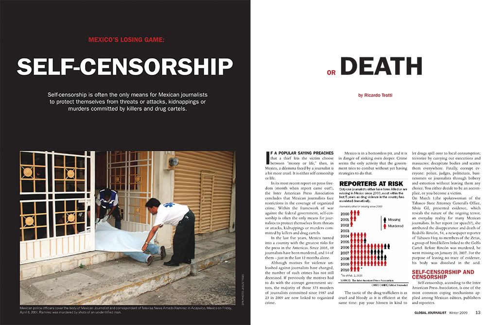
On a different note, we also had our Meredith Commission presentations today. Thankfully a majority/all of the presentation was left in the hands of the creative directors (sorry, Cara!), so I got to sit back and see all of the prototype groups' work.  In all, I love everything - literally. The color palettes are all so beautiful, and the designs look extremely professional ... I'm just so proud of my friends! :)

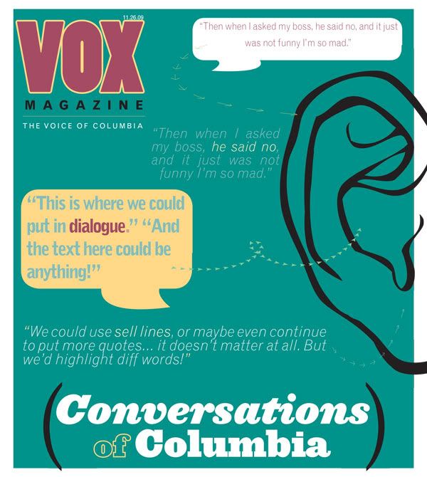
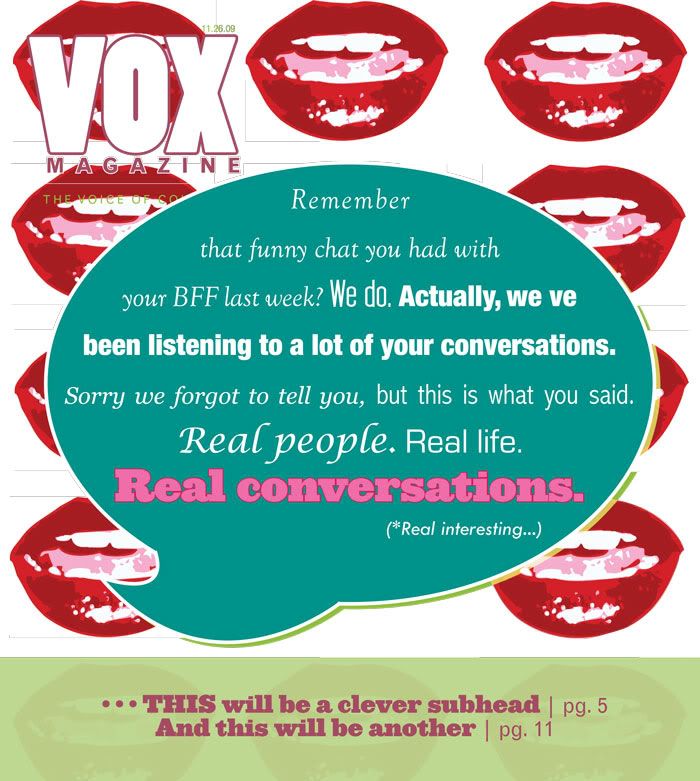
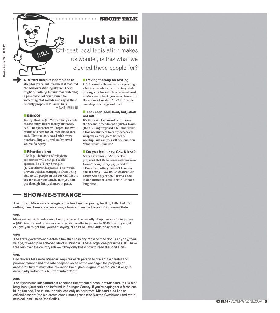
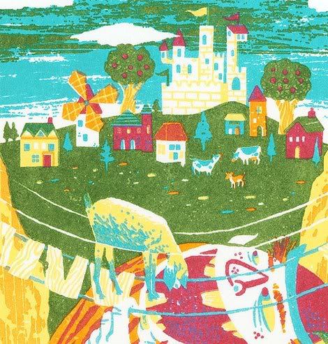
Now, I'm leaving you with some of my cover revisions.  They were due earlier than normal this week, which actually works perfectly with my midterm schedule/other classes. In general, I ended up scrapping most of my original concepts.  Sad, but it was the only logical option for me as I knew that I didn't have the right take on the story the first time around. So, while I left the ears in place, off went the lips, and quite a few text bubbles.

This last one (black cover) was chosen as the winner for the 4/8 issue, but still has a lot of work to be done on it. But in all, I'm happy with it, and am excited to see what it evolves into throughout the upcoming weeks. 

Whew. A novel later, I think I'll wrap up. Enjoy the day, and happy early Spring Break! :)
- Cassie

3.22.2010

You Cannot Miss This: Website Trends

As I continue to work on my website, I find that the biggest help (aside from tutorials) is looking at/evaluating real-life examples.  In doing so, I get a better sense of what works, what doesn't, and gather inspiration for my own site.

Earlier today, I was browsing colourlovers.com, and found a really cool section that recognizes website trends.
This is a snapshot of this portion of the website.  I think it's a really great representation of different ways to present material, and in this particular image, a great resource of various ways to create a site's header.  I've been having trouble with choosing a style for my own portfolio, and these examples definitely help me at least determine which direction I want to go in.

Critique: misCONCEPTions

Last week, I mentioned the three cover concepts that I was working on and had to present to the class on Thursday.  These covers were to be designed for the "Dialogues" feature, which is a compilation of mini articles that feature overheard conversations from around Columbia.

Turns out, what my cover design group and I had conceptualized as a feature on voices from around Columbia, was actually something quite different.  This caused our designs to be a little less than representative of the stories, and in turn, made them fall a bit flat.  My designs were a bit too generic, and therefore, I will be redesigning them completely, rather than simply finishing their execution.

Headache.

Of course nobody wants to hear that all of their (hard) work won't actually work, and I think my frustration read pretty clear all over my face.  But that's life. And it wasn't that I disagreed at all - I definitely understood the critiques, and am very interested in where my mind will take these designs.

That said, here are the designs that I presented last week.  At the time, I saw the story as being a modern day expose of dialogues.  For me, the mini stories are small glimpses into other peoples' lives that reveal truths about our society and our ways of communicating.
Here, I wanted to represent the eavesdropping aspect of the stories - the fact that VOX reporters had overheard these conversations, and were writing these candid moments down to later share with the rest of the world.
This cover was driven by the literalness of conversation and the act of talking. The mouths are to repressed the talking, the different voices, and the modernness of it all. I wanted it to be abstract, while still conceptual, without relying too heavily on the only thing that I thought the mini stories shared.
This last concept took the obvious "text bubble" and incorporated it with the talking mouths. The text within the bubble conveys a message that implies to the reader that it could have been their conversations that we were listening to, which  gives this implication of "you" and making it relatable. I wanted to draw the reader in by the everyday-ness of the feature, and represent the various voices within the conversations with different text sizes and weights. 

Now as I head back to work on these covers, more or less from square one, I have a better idea of what kind of message we want them to have, and what I should probably stay away from.  I'll keep you updated on my progress!

- Cassie

3.17.2010

Critique: I'm just a weird bill...

Of all of my least favorite things to do in the world, designing department pages is rapidly climbing to the top of the list.

Being dramatic? Possibly. Exaggerating? Not at all. It's absolutely miserable for my type of personality.

For one, when it comes to design, I'm extremely detail-orientated. (This is weird, as in life, I'm quite the opposite.) But really, this just makes everything take about three hours longer than necessary. So, last Sunday as I sat at my post in the VOX office and overly analyzed every single aspect of my (five) pages allotted to design. Overwhelmed, I positioned, and then reposition, every image/set of text about a million times. Oh, and have I mentioned that I'm horrible at puzzles? It's not fun. I try to make things work, and then they don't... until about five hours later.

To cut myself off... let's just say that my second department design experience was draining. But, in retrospect, it's a skill that I'm going to have to get good at - every publication has departments, and every department has tricky situations. I've got to learn to work a little faster and stop overanalyzing the little things, which go hand-in-hand. 

That is my goal for the next couple of weeks: pick up the pace and be confident in what I do. 

Anyways, here are the rough copies of my "Short Talk" pages (p.s., the grey spaces = ads.) Oh, and I'll give special notice to my little "weird Bill" illustration. He just makes me happy, and creating him actually upped my Illustrator knowledge a ton. So for that, I am grateful :)

Last but not least, I'm currently working on/almost done with my three cover concepts for the 04.08 issue.  The concept is based off of the "dialogues" feature, which is a piece of a bunch of mini stories compiled together.  All of the minis are of conversations heard in random places around Columbia... and it's actually pretty fun trying to conceptualize visually! I'm presenting my ideas tomorrow in class, and then I'll be sure to post them on here asap. 

Have a great rest of the week, and happy St. Patrick's Day from someone not Irish at all!
- Cassie

In Response To: Design Magazines


In class yesterday, we spent the entire time looking at and discussing design magazines.  It was wonderful.

When it comes to magazines not designed for designers, it's sometimes difficult to draw much inspiration.  Granted, my favorite publications typically have one or two feature designs that I like, but for the most part, the rest is really formatted and ad-heavy. 

Magazines such as HOW and Print are so great because they are designed for people who...well... like me :) They think conceptually, know (and reflect) the current trends and provide a platform for designers everywhere to showcase their work.

In class, we specifically discussed the typography and grid choices.  Surprisingly, Print likes to dabble in font size variation...and almost to a fault.  Eh, at least in my opinion. Instead of adding excitement (or whatever they're trying to do - add emphasis to particular stories, maybe?)... what happens instead is their magazine loses a bit of its refinement.  While looking at their layouts, I was often distracted and overwhelmed.

Other than that, Print is a brilliantly designed magazine, as well as HOW.  And, if they weren't $20/issue, I'd definitely have every issue, every time. 

3.15.2010

You Cannot Miss This: Movie poster magic

Fun fact about Cassie? I'm a huge movie buff.  And even though I have very little time (or money) to donate toward my hobby of watching and collecting movies, I've found a way to work them back into my life: their posters!

Up until recently, I hadn't really thought much about the design work that goes into creating them... Usually I only look at them in passing, or as I'm ripping the dvd out & discarding the case without much thought.  And that's unfortunate, because there really is an often-overlooked beauty about movie posters.

Sure, some of them merely rely on a good-looking actor to carry all of the weight, but most of them assume people are a bit more complex than that.  And, in that realization, most are designed with the concept of the movie in mind, and are extremely innovative.  Here are a few that I found while looking around:


All of these have either incredible conceptual grace, amazing typography, movement and/or innovation.

And yes, I'm kidding about that last one... hehe.

But really, what I love most about these posters is that it reminds me that brilliant design is everywhere, and not just in abstract things.  Noticing these different forms of brilliant design will not only broaden our ability to create for the world, but also opens our minds and allows us to be inspired by much, much more.  And, it doesn't hurt to recognize and appreciate fellow designers right? We are all of the same craft, after all.

Have a great day!
- Cassie

3.10.2010

Critique: Global J. (& yep, more logos)

This past week, I designed a feature for Global Journalist magazine.  It was a great experience, mostly because it gave me the opportunity to work for a publication that has an extremely structured format.  No, I didn't get the chance to "spread my wings" as much as I would have liked to, but no harm done.

Actually, I'm very happy with the way the design turned out (considering the constricting guidelines). I had a pretty decent idea of the format prior to beginning my design, so from the start, I developed my ideas/concepts within those limits.  In the end, the art director changed very little, and my original design is extremely close to the final draft.

The story is about a huge problem in Mexico: Journalists are going missing (most murdered) because of the content of the press, and are being forced to choose between self-censorship or death.  I wanted to show this "lose/lose" situation in my design - how although it is a very complicated situation, the options given to journalist are quite clear; for them, it's all very black or white.


We also had to present/turn in five fully executed logos in class yesterday. These logos were chosen from the 20 that we presented last Tuesday, and my choices were largely influenced by both Jan and my classmates' critiques. And without meaning to, I ended up executing six designs (I miscounted, of course.)
For a couple, I changed very little; but for the rest, they hardly resemble the original design. And I'm okay with that. I like three of them very much, but I'll let you make up your own mind and keep that to myself! :)

- Cassie

You Cannot Miss This: Bond with your creative side

Okay, so I may be obsessed with all things "creative," but I really do think that once I am fully in-tune (or at least progressing in that direction), I'll become a much better designer.  After all, the most successful are those who have an understanding of their own flavor.

So.... there is this really cool article on Howdesign.com called "Make this Month More Creative". It's broken into four weeks, and each one targets a different way to broaden your ways of thinking. For example, it says that for the first week to pick one project, and then tackle it in a different way each day of the week. (This is the same concept of what we did in class with the logo assignment!)

I really want to try this process out - maybe I'll even start next week. I'll let you all know it goes!

- Cassie

(Photo credited to http://howdesign.com/article/creativemonth/)

In Response To: "The September Issue"

Yesterday in class, Jan was gracious enough to have us watch The September Issue ... and it was amazing.

Prior to watching this movie, I honestly had very little interest in seeing it.  Sure, I enjoy my Vogue subscription from time to time, but I've been feeling extra broke in the money department lately, and I figured that watching Queen Wintour prance around Manhattan would only make me bitter.

I was wrong.

Instead, Anna Wintour inspired me far more than the creative director (Grace Coddington, who is a genius nonetheless.)  But, it wasn't Wintour's glitz, glam or her sassy personality that captivated me (although I loved every bit of all it); instead, I loved her passion, strength and drive.  She has so much power - over the fashion industry and over other people - and it's amazing to see a woman achieve that. And, I don't think she's that mean. She's honest and she knows what she wants, and I think every woman should be that confident in her craft... fashion or not.

3.03.2010

Critique: Logo love & horseshoes galore

A couple of weeks ago, our class had a conference call with Broadway performer and country music's rising star, Laura Bell Bundy.  In the interview, she helped us explore her personality so that we may best represent her in our logo designs. The assignment, which we presented in class yesterday, was to design 20 different logo ideas for LBB, and try to make each design an individual/unique concept.

I knew right away how difficult it would be - many times when I'm brainstorming, I feel as though my brain reaches creative capacity circa concept number three.  That said, I was intrigued with the thought of possibly being able to do this, so I took a shot at it.  In the end, I feel that I did a great job at making my ideas as unique from each other as possible.  Some of them are (obviously) better than others, but that is expected.  (It will actually make my life easier when choosing which five to fully execute for next week.) Anyway, here are the designs that I came up with and presented in class yesterday:


In all, the entire process was extremely beneficial. I am now confident that I can create beyond my own imagination, and the input of my peers helped me see the potential of some of my designs that I hadn't previously appreciated.

A full execution is due next Tuesday, and following class, I will post those online for you too see! Thanks for coming by,

- Cassie May

In Response To: Prototype hype

My prototype experience was a great learning opp, but a little disheartening nonetheless.

My group's magazine, Boost, is geared toward those interested in home investments and making their homes as sellable as possible, regardless of whether or not they intend to put it on the market.  For this particular assignment and portion of the project, we were to create prototypes for the cover, a department and a feature.

I quickly realized that the research & brainstorming process was far more taxing than the actual execution, (which was still no cake-walk... at all.)  But really, I spent a lot of time trying to make sure that I understood everything about the magazine and was representing the ideas of my publishing teammates as much as possible.  I also wanted to make sure that every single aspect of my prototypes done in the actual execution phase was done with purpose, which was one of the most important things to me.  In the end, after multiple phone calls made home to my parents (who are currently selling their home) and a million discarded scratch papers, (which are currently scattered under my bed), I came up with what I felt was a solid rendition of what Boost should look like:
BOOST, cover prototype
BOOST, department prototype
BOOST, feature prototype

In my opinion, you could find this magazine on the newsstand, and it could hold its own.  It grabs attention, is fresh and innovative, and articulates the mission of BOOST. Unfortunately, my concept was not picked for the project.  Yes, this was disheartening for me, as I really did put a lot of time & effort into every aspect.

That said, it was very hard to be bitter, especially with my fellow design teammates in mind.  Both Stef and Cara presented amazing prototypes, and Cara's was chosen as our team's main concept.  So, while I was upset that mine wasn't picked (boo-hoo, right?), I am excited to work with hers - it's fresh, clean and does represent our magazine fully, just in a very different way that I had imagined.

All in all, the lesson was learned: There will always be a million different ways to present one single idea, and it all comes down to what people prefer for that particular situation.  I can appreciate that - especially when Cara did such a fabulous job. Our group has really exciting potential, and I cannot wait to get back to work on this project.

You Cannot Miss This: Master illustrator, S.britt

GrainEdit.com recently posted an interview with S.britt, an amazing illustrator from Portland, Oregon. What is so fascinating about S.britt, aside from his funky use of color and humor and amazing ability to create, is where he says he gets his inspiration.  Here is an excerpt from GrainEdit's interview with him, (which can be found in full here GrainEdit.com):
Who or what are some of your influences?
" Raindrops on rummies and whiskers on women
Bright copper swamp stills and buck naked swimmin'
Covered in calamine, to soothe the wasp stings
These are a few of my favorite things!
Big Chief tablets and Sharpies for doodles
Schlitz and tuna fish and Top Ramen noodles
In a tattered blue bathrobe, fit for a king
These are a few of my favorite things!
Raccoons and hobos that go through your trashes
Thirty-one bite marks and red swollen scratches
A dozen more rabies shots just before spring
These are a few of my favorite things!
When the rent's late, when the water breaks
When I'm feeling sad,  
I simply remember my favorite things, and then I don't feel so bad!"
 (If this tune isn't stuck in your head for the remainder of the day...) But really, I love his answer to this sometimes over-asked question.  In a roundabout way, S.britt is crediting everything in life as his inspiration, which is something we all may take a bit too for granted. After all, there is undoubtedly something amazing sitting right outside your window... and I for one, need to remember to always take that second look!

Here are a few examples of S.britt's amazing work... and the inspirations he talks about are definitely present. He's wonderful. Oh, and if you get the chance to check out his website, that's pretty wonderful, too.
(All photos credited to GrainEdit.com and S.britt)