4.28.2010

You Cannot Miss This: Dontclick.it

Okay, so apparently I'm a sucker for gimmicks.

Earlier today, whilst browsing the web for something that my peers and I just had to know about, I ran into this pretty cool website.  It's called dontclick.it, and it literally revolves around the notion that you (the user) are not allowed to click your mouse. Well, except for in the very beginning.


Anyway, in the spirit of learning to create websites, I found this to be extremely appropriate. To their credit, the site is extremely interactive, engaging, and pretty entertaining despite the fact that you're really not doing anything at all except rolling over text. That said, me being the new web coder/aficionado that I am (ish...), I do think that because the site only deals with rollovers, it's a bit too confusing and easy to get trapped in areas of the page that you don't want to be in.

Still, I think it's definitely worth checking out... I appreciate the randomness and willingness to try (and develop) new ways of living.

Take care, and happy rolling!

http://www.dontclick.it <--- link. go now :)

- Cassie

4.21.2010

Critique: Web work

Aside from all of the work we're all doing on our Meredith prototypes, we're also working vigorously on our portfolio websites.  Most of us have only working knowledge of html coding, let alone how to fully articulate ourselves as designers for the rest of the world to see.  Getting all of our work online and presenting ourselves in the way we want to be perceived is extremely daunting, which also means that the perfectionist side of me has been out full-force.

Here are a few snippets of my work in progress, (emphasis on the work in progress part):
* image of my home screen


* image of my "about me" page (same template that the other pages follow)

Yesterday's class time was actually spent critiquing our classmates' sites, which I found to be very helpful. I plan to rethink the navigation, as well as the presence of the bar running across the top. Once I make those small changes, and actually get images in place, I think my website will do a really good job at representing me.

I plan to have my website up and running over the next couple of days, and when it is, I'll be sure to post the link for you all to check it out!

Until then,
Cassie

In Response To: SSND contest

A couple of weeks ago, I entered two of my design pieces in the College News Design Contest. To my surprise (you have no idea), I actually won 1st place for the "Cover of a magazine or newspaper special section" category with my Spring Preview design.

Originally published as the cover for the 2/4 issue of Vox, I wanted the cover to represent the magazine in a playful way, while also integrating a little bit of sass and staying true to my personality. While creating it, I was driven by the concept of the old saying "April showers bring May flowers," which is represented in the blue stripes (as rain), umbrella and new growth (flowers).  A lot of work was done in finalizing the design, and the revisions made on the original draft definitely helped elevate it to where it needed to be.  (Thanks Aimee!!)

Overall, aside from still being shocked by the decision, I am incredibly grateful for the recognition.

- Cassie

You Cannot Miss This: Petri dish art

Today, while aimlessly browsing one of my favorite design blogs colourlovers.com, I found a great post about petri dish art.

I've never been much of a science kind-of-girl, but had my lab classes involved these dishes, I may have actually enjoyed them (and gotten a better grade.)

A large part of why I am in design in the first place is because of my appreciation for the art.  I am driven by our ability, as designers, to beautify the world - even if only in the smallest of ways.  Klari Reis, the artist responsible for these beautiful art pieces, does an incredible job at making something that is normally overlooked, noticeable (to say the least.)

To summarize the original article, which can be found here, Reis hand paints plexiglass petri dishes and uses careful techniques in order to most accurately represent what is typically seen when looking through a microscope.

If nothing else, Reis reinforces the concept of thinking outside of the box, and serves as yet another reminder that all ideas can be made into beautiful ideas and to never, never discard any of them.

- Cassie

All photos credited to Klari Reis

4.14.2010

You Cannot Miss This: Creative advertising

After my hour long search for something inspiring, I found the incredible: creative advertising at its best.
These ads, which I randomly found at eatnineghost.com, are not only fun to look at, but definitely support my yearning to expand out of the box. Nothing about these ads is average or expected.  Sure for some, the thought may have crossed their mind once or twice, but was more than likely quickly dismissed for being too "out there." (Aka, playing it safe.)
And the designs are "out there," but that's what makes them so cool. If more of us "creative design folk" would strive to think unrealistically more often, I'm confident that the world would be a much more fun place... and so much more expressive. I mean really... how could you have a bad day after passing this masterful creation? I bet you couldn't...
Now go be weird and inappropriate... some great design idea may come of it!

Xoxo,
Cassie

**All photos credited to eatnineghost.com

Critique: The theme issue

Dum dum dum.

Sooo, I realized last Monday that I am one of the "lucky" four who were assigned to the upcoming "Religion & Sex" theme issue, which can also be seen as a temporary, yet extremely overwhelming redesign of Vox. The four of us will actually work as a team this time (rather than competing against each other), and will design the cover, four features, and set templates for the departments.

Still, as overwhelmed as I may be, I have to admit feeling lucky to have gotten this opportunity. There's a lot of room for creativity with this project, and after we decide on a theme, the rest shouldn't be TOO incredibly difficult. (I'm trying to be optimistic here.)

I'll make sure to keep you all updated on our progress...wish us luck!

- Cassie

In Response To: LBB & more prototypes

Yesterday in class, we had another teleconference with LBB to discuss our logos.  As expected, she really appreciated that we had done such a great job listening to her and respecting her likes and dislikes.  And, probably even more expected was her adoration for the horseshoes. And I respect that... that's her "thing."

For the most part, she said that she liked my designs, but would change the typography to be a little more vintage/country than I had. So, in order to prep for the next round, I'll probably play around with all of the ones that she had seen and made suggestions about, and choose the one to send back to her at that point. As of right now, I have no real preference on any of them, which is probably as a result of so much time having gone by since I first made them.

We also discussed our prototypes in class, which was incredibly beneficial. In all, our group definitely needs to put some serious extra work in to make sure that all of the details are cohesive and polished... especially the color scheme. But, I'm not really worried at all, and I know that in the end, it'll look great.

- Cassie

4.07.2010

Critique: A very Voxy Easter

It's hard enough getting your work to actually work... let alone trying to do that with other people/a publication in mind. 

As mentioned about a week ago, my cover was chosen for the "Dialogues" feature & 04/08 issue of Vox. Going into it, I knew that this would be no easy feat... I had a week-long break against me, and about 1000+ miles. Communicating with people who were in a different time zone and were surrounded by a completely different set of eyes and opinions is pretty tricky. Still, somehow it all worked out.

Aimee was (basically) present at my family's Easter dinner (which consisted of fajitas and mango mojitos... such traditionalists, i know.) But really, I felt bad that I wasn't in Missouri, and I know it had to have been pretty frustrating from the other end... not having the designer in person and all (...or in the same state even.) Still, I can't say my parents seemed to mind at all. Actually, I think my dad loved my mysterious phone calls, and even got a sense of pride out of seeing me design in action. That made it all worth it. Aw.

Anyway, what began as a stressful obstacle for me, actually turned out to be something that I was pretty happy with.  That said, I do think the final cover is quite different than my original concept, but only in the small details. Could it have been better? Absolutely.... the cover is below average, and I hate average.  But I guess that's life... live & learn. 

Until next time,
Cassie

You Cannot Miss This: Abstract Photography

In light of our recent photography assignment, I found an awesome post by colourlovers.com on Abstract Impressionistic Photography. Very similar to what we were asked to do in class, this post talks about using photography as a  means of capturing moments in life that serve as incredible inspiration for design.
Photo credited to Greg Considine
From these "abstract" photographs, we are able to pull natural, yet innovative palettes, as well as ideas of movement, contrast and texture.
Photo credited to Paul Pacey
I'm definitely not a trained photographer of any sort, which is not for a lack of appreciation of the art. I love the idea of using the world around you as a form of inspiration, and if anything else, this blog, along with our previous assignment, enhance my desire to become a better "user" of the outside world!
 
Photo credited to Paul Pacey

4.06.2010

In Response To: Vegas/San Diego Spring Break 2010

Over spring break, we were given the assignment to take photographs of things in our environment that might serve as design inspiration.  From these photographs, we were to create an online booklete, as well as a logo that represents the overall package. 

Fortunately, I had a lot of material to choose from, as Las Vegas and San Diego each have a ton going on. Here are the pictures/logo that I presented in class... enjoy!
Found Typography: Las Vegas Lights
The Venetian, Las Vegas
Inside a hotel, Las Vegas
Illusion
Caesars Palace, Las Vegas
On "The Strip", Las Vegas
LAX nightclub, Luxor Hotel, Las Vegas
Trolly Station, San Diego
San Diego
San Diego

This assignment was really fun for me to do.  A majority of my design inspiration stems from things going on in the world-- from a bright flower to a couture outfit on the runway.  In all, this assignment helped enhance my ability to notice things around me, and noticing them in a way that one wouldn't normally at first glance.

3.23.2010

In Response To: Portfolio reviews & Meredith

Today, I finally had the chance to meet with Jan to discuss my progress-to-date and my portfolio options. In terms of what I need to work on for my portfolio, (which I need to get a move on, asap; jobs are not going to wait around for me... unfortunately), there's definitely some solid stuff already in there.  That said, I do have a lot of work to do so that some of my lesser pieces are "performance ready." Add that to my list of things to do during Spring Break. Hmph.

Complaining aside, the truth is that I love doing this stuff. I don't mind having design homework - I don't even mind making revisions (aka, scrapping) designs that I am in love with. (Yes, I loved my Andy Warhol-esque covers from last week.) But really, I could spend all day working on different concepts and pushing my creativity to the limit... because there's no better feeling than creating something from nothing, and being really proud of it.

Jan's talk with me today definitely motivated me to just keep on pushing.  I'm figuring out "my style", and somehow maintaining my sense of self in a majority of our assignments. And that makes me happy...and encouraged. At the end of the day, I want to be unique and original, and set apart from the crowd, so that's what I'm after.

On a different note, we also had our Meredith Commission presentations today. Thankfully a majority/all of the presentation was left in the hands of the creative directors (sorry, Cara!), so I got to sit back and see all of the prototype groups' work.  In all, I love everything - literally. The color palettes are all so beautiful, and the designs look extremely professional ... I'm just so proud of my friends! :)

Now, I'm leaving you with some of my cover revisions.  They were due earlier than normal this week, which actually works perfectly with my midterm schedule/other classes. In general, I ended up scrapping most of my original concepts.  Sad, but it was the only logical option for me as I knew that I didn't have the right take on the story the first time around. So, while I left the ears in place, off went the lips, and quite a few text bubbles.

This last one (black cover) was chosen as the winner for the 4/8 issue, but still has a lot of work to be done on it. But in all, I'm happy with it, and am excited to see what it evolves into throughout the upcoming weeks. 

Whew. A novel later, I think I'll wrap up. Enjoy the day, and happy early Spring Break! :)
- Cassie

3.22.2010

You Cannot Miss This: Website Trends

As I continue to work on my website, I find that the biggest help (aside from tutorials) is looking at/evaluating real-life examples.  In doing so, I get a better sense of what works, what doesn't, and gather inspiration for my own site.

Earlier today, I was browsing colourlovers.com, and found a really cool section that recognizes website trends.
This is a snapshot of this portion of the website.  I think it's a really great representation of different ways to present material, and in this particular image, a great resource of various ways to create a site's header.  I've been having trouble with choosing a style for my own portfolio, and these examples definitely help me at least determine which direction I want to go in.

Critique: misCONCEPTions

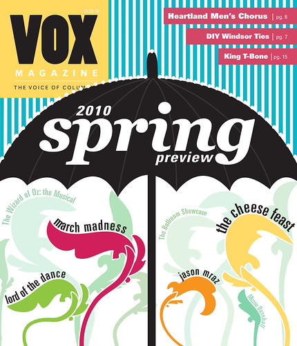
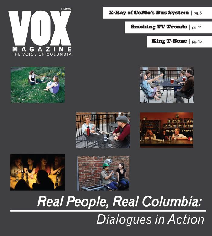
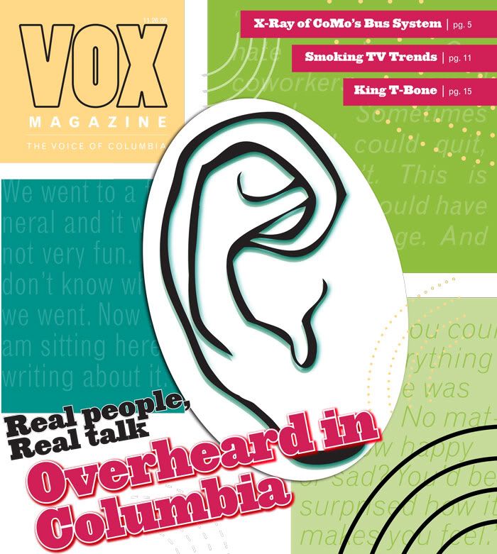
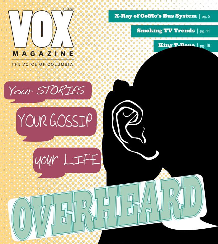
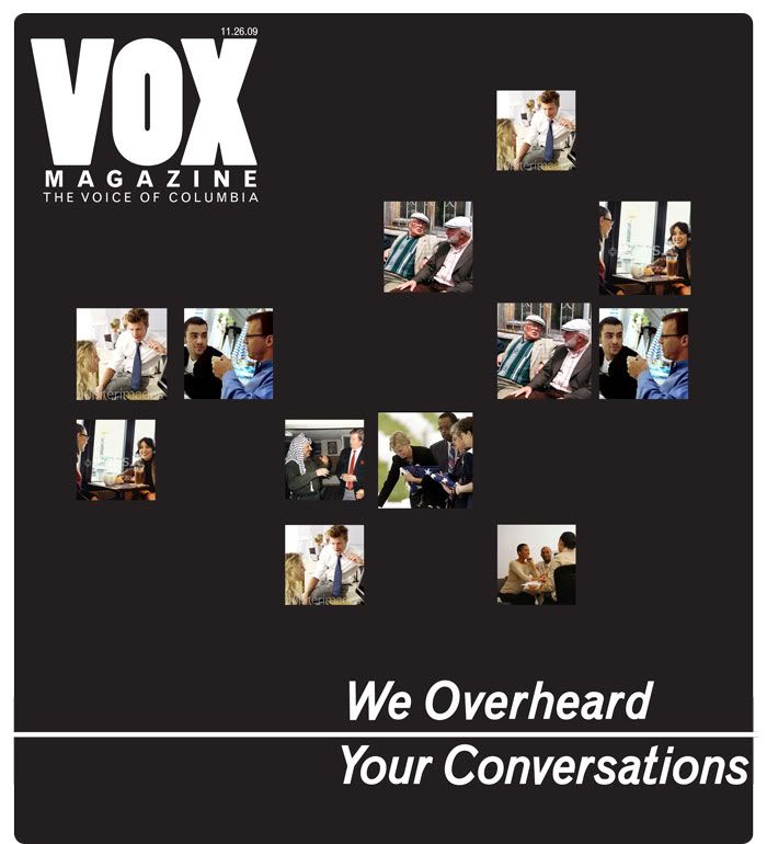
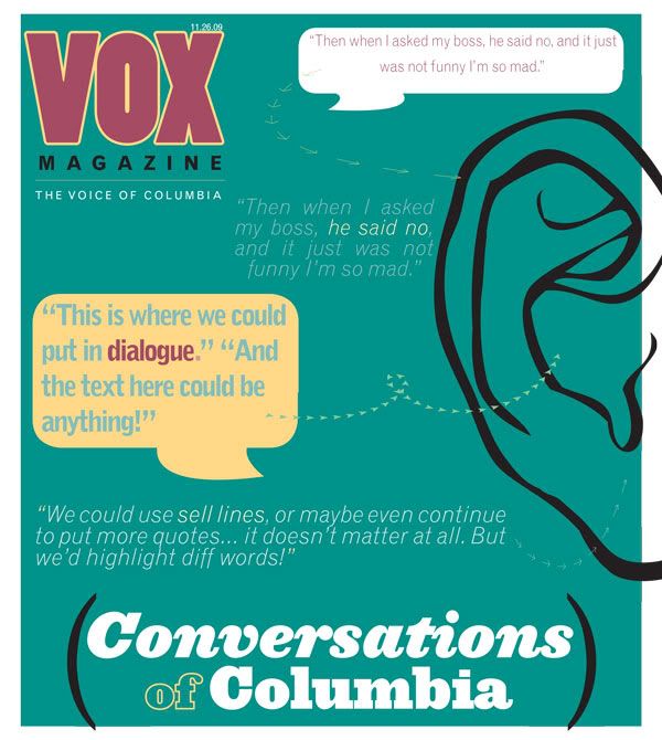
Last week, I mentioned the three cover concepts that I was working on and had to present to the class on Thursday.  These covers were to be designed for the "Dialogues" feature, which is a compilation of mini articles that feature overheard conversations from around Columbia.

Turns out, what my cover design group and I had conceptualized as a feature on voices from around Columbia, was actually something quite different.  This caused our designs to be a little less than representative of the stories, and in turn, made them fall a bit flat.  My designs were a bit too generic, and therefore, I will be redesigning them completely, rather than simply finishing their execution.

Headache.

Of course nobody wants to hear that all of their (hard) work won't actually work, and I think my frustration read pretty clear all over my face.  But that's life. And it wasn't that I disagreed at all - I definitely understood the critiques, and am very interested in where my mind will take these designs.

That said, here are the designs that I presented last week.  At the time, I saw the story as being a modern day expose of dialogues.  For me, the mini stories are small glimpses into other peoples' lives that reveal truths about our society and our ways of communicating.
Here, I wanted to represent the eavesdropping aspect of the stories - the fact that VOX reporters had overheard these conversations, and were writing these candid moments down to later share with the rest of the world.
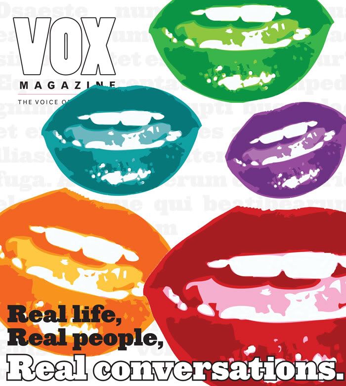
This cover was driven by the literalness of conversation and the act of talking. The mouths are to repressed the talking, the different voices, and the modernness of it all. I wanted it to be abstract, while still conceptual, without relying too heavily on the only thing that I thought the mini stories shared.
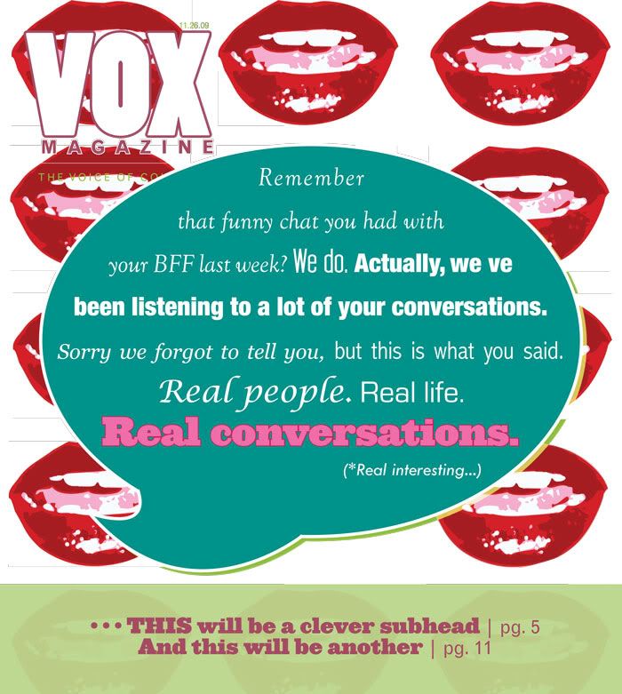
This last concept took the obvious "text bubble" and incorporated it with the talking mouths. The text within the bubble conveys a message that implies to the reader that it could have been their conversations that we were listening to, which  gives this implication of "you" and making it relatable. I wanted to draw the reader in by the everyday-ness of the feature, and represent the various voices within the conversations with different text sizes and weights. 

Now as I head back to work on these covers, more or less from square one, I have a better idea of what kind of message we want them to have, and what I should probably stay away from.  I'll keep you updated on my progress!

- Cassie

3.17.2010

Critique: I'm just a weird bill...

Of all of my least favorite things to do in the world, designing department pages is rapidly climbing to the top of the list.

Being dramatic? Possibly. Exaggerating? Not at all. It's absolutely miserable for my type of personality.

For one, when it comes to design, I'm extremely detail-orientated. (This is weird, as in life, I'm quite the opposite.) But really, this just makes everything take about three hours longer than necessary. So, last Sunday as I sat at my post in the VOX office and overly analyzed every single aspect of my (five) pages allotted to design. Overwhelmed, I positioned, and then reposition, every image/set of text about a million times. Oh, and have I mentioned that I'm horrible at puzzles? It's not fun. I try to make things work, and then they don't... until about five hours later.

To cut myself off... let's just say that my second department design experience was draining. But, in retrospect, it's a skill that I'm going to have to get good at - every publication has departments, and every department has tricky situations. I've got to learn to work a little faster and stop overanalyzing the little things, which go hand-in-hand. 

That is my goal for the next couple of weeks: pick up the pace and be confident in what I do. 

Anyways, here are the rough copies of my "Short Talk" pages (p.s., the grey spaces = ads.) Oh, and I'll give special notice to my little "weird Bill" illustration. He just makes me happy, and creating him actually upped my Illustrator knowledge a ton. So for that, I am grateful :)

Last but not least, I'm currently working on/almost done with my three cover concepts for the 04.08 issue.  The concept is based off of the "dialogues" feature, which is a piece of a bunch of mini stories compiled together.  All of the minis are of conversations heard in random places around Columbia... and it's actually pretty fun trying to conceptualize visually! I'm presenting my ideas tomorrow in class, and then I'll be sure to post them on here asap. 

Have a great rest of the week, and happy St. Patrick's Day from someone not Irish at all!
- Cassie

In Response To: Design Magazines


In class yesterday, we spent the entire time looking at and discussing design magazines.  It was wonderful.

When it comes to magazines not designed for designers, it's sometimes difficult to draw much inspiration.  Granted, my favorite publications typically have one or two feature designs that I like, but for the most part, the rest is really formatted and ad-heavy. 

Magazines such as HOW and Print are so great because they are designed for people who...well... like me :) They think conceptually, know (and reflect) the current trends and provide a platform for designers everywhere to showcase their work.

In class, we specifically discussed the typography and grid choices.  Surprisingly, Print likes to dabble in font size variation...and almost to a fault.  Eh, at least in my opinion. Instead of adding excitement (or whatever they're trying to do - add emphasis to particular stories, maybe?)... what happens instead is their magazine loses a bit of its refinement.  While looking at their layouts, I was often distracted and overwhelmed.

Other than that, Print is a brilliantly designed magazine, as well as HOW.  And, if they weren't $20/issue, I'd definitely have every issue, every time. 

3.15.2010

You Cannot Miss This: Movie poster magic

Fun fact about Cassie? I'm a huge movie buff.  And even though I have very little time (or money) to donate toward my hobby of watching and collecting movies, I've found a way to work them back into my life: their posters!

Up until recently, I hadn't really thought much about the design work that goes into creating them... Usually I only look at them in passing, or as I'm ripping the dvd out & discarding the case without much thought.  And that's unfortunate, because there really is an often-overlooked beauty about movie posters.

Sure, some of them merely rely on a good-looking actor to carry all of the weight, but most of them assume people are a bit more complex than that.  And, in that realization, most are designed with the concept of the movie in mind, and are extremely innovative.  Here are a few that I found while looking around:


All of these have either incredible conceptual grace, amazing typography, movement and/or innovation.

And yes, I'm kidding about that last one... hehe.

But really, what I love most about these posters is that it reminds me that brilliant design is everywhere, and not just in abstract things.  Noticing these different forms of brilliant design will not only broaden our ability to create for the world, but also opens our minds and allows us to be inspired by much, much more.  And, it doesn't hurt to recognize and appreciate fellow designers right? We are all of the same craft, after all.

Have a great day!
- Cassie