1.27.2010

You Cannot Miss This: Bedding & pottery?

Bedding and pottery - two things I would have never expected myself to appreciate. And that's the beauty of everyday inspiration.

In the previous entry, I mentioned my recent obsession with noticing every little thing in life and it's "designability." (I may have just made up that word?) But really, I notice everything now.

Ev-er-y-thing.

Including my bedspread.

Obviously I chose the 'spread because I liked the way it looked, but I hadn't really thought about why. Of course not until now.

Last night, I was brainstorming for designs (surprise, surprise), and realized that I really enjoy the color orange; orange is definitely doing great things for me - especially when used with yellows, reds and blues. Green doesn't hurt either. And I thought my love for this color palette was a new development, until I walked into my bedroom and noticed my 'spread.


Turns out, I've always loved the color palette and didn't even know it! (Safe to say that I now sleep a little better at night.)

Speaking of color, one of my favorite design blogs, colourlovers.com, is the hot spot for inspiration. This blog teaches me, on a daily basis, how to appreciate the little things, and to notice unique color combinations.  As of yet, my favorite post was about their appreciation of Hornsea Pottery:

Photo credited to H is for Home

I love the designs on the pottery, as well as the use of teal, orange and gold, and really look forward to being able to create something involving these ideas!

That's all for now, friends! Have a very inspired day!
- Cassie May

In Response To: A very hectic week

"Hectic" = Busy to the point that my friends think that I'm lying when I say I can't socialize because of deadlines.


I swear, syllabus week just isn't what it used to be. 

Moving on, my first response is dedicated to my classmates, Erica & Laura.  I credit both of them for their winning designs this week... (good job, ladies!) Sure, it's a "competition," but it's hard to be at all bitter with the understanding of how much work it takes in order to create the kind of designs you want under such tight time constraints.  Oh, the pressure.

The winning cover utilized "the bathroom man," who was illustrated doing various actions that signified his journey in becoming a man. When I initially saw it, I had one of those "duh" moments.  You know... where it's such a great idea, which involves something so common in everyday life, that you wish you had thought of.  I feel like some of the best ideas come from the obvious, yet not so obvious, things in life. In other words... I now find myself looking at everything more critically. And I mean everything. 

"Hm, my bedspread would be a great color palette for a design... and look at that doorknob..." 

Yeah, it's almost a problem, and it's only been a day. My brain hurts.

Erica's feature design, the evolution theme, was a bittersweet thing for me. It was the first idea I had for the spread, but after about an hour of trying to think of how to make it work, I realized that no matter how many tutorial videos I tried to cram into my brain, I just didn't have enough time to figure out how to do what I wanted. Erica, however, executed it like a pro.

Aside from looking at each others' designs, our class also served as City & Regional Magazine Association 2010 preliminary judges.  For over an hour, we analyzed and critiqued awesome (and some not-so-awesome) spreads from City/Regional magazine designers. This experience verified my love for this form of creative expression; design is so inspiring and unpredictable.

When I got home, I sat on my bedroom floor, ripping out my favorite designs from old magazines to collect in a folder.  And, after an hour, I realized that a) I had more designing to do, and b) I had found my new favorite form of relaxation.

Yeah, I think it's safe to say that design is taking over my life :)

- Cassie May

Critique: "From Boys to Men"

In order to succeed, you must take that leap that you aren't so sure about - the one that terrifies you in the best way possible. This is it for me.

Last Tuesday was the first day of my capstone - Advanced Magazine Design.  In other words... the most insecure part of my life. Fortunately, I know that this class will not only help develop my designing skills, but also make me more confident in my creativity.  I think that I large part in being a great designer is trusting instinct, which comes second to actually knowing the craft.  Last semester (in Beginning Design, again with Jan), we were taught to actually think about what we were doing. Crazy concept, I know. But really, there is a huge difference between being creative for the sake of making something pretty, and being creative for the sake of the work.

And this is where my blog title comes in.  "Beyond Good Looks" is the understanding that great design is more than what you get at face value.  Sure, something can look great, but does it represent what it's supposed to? There's more to everything in life than appearances - even a craft that is so visual.

I'm still learning to design with this in mind.  Actually, I think I design with this too much in mind, but it's only because I appreciate what being "content driven" stands for. And I'm still learning, which brings me to CDG (Cassie's Designing Goals) #1: stop over-thinking.  (Don't worry, I'll keep you updated on my progress.... in case you were worried.)

All of that said, I bring you Assignment #1. We had to decide between a pimp-my-ride-esque story, and one about the journey boys make (or delay) toward becoming men. This was a tricky decision to make, as neither story really jumped out at me... but seeing as I have a bit of experience with boys still stuck in that still-not-yet-a-man phase, I decided to take a stab at it.

And so came the drawn-out process of brainstorming. And, for your entertainment, my piece of "idea" notebook paper looks a little something like this:

  • The words evolution, journey, manhood, dude, bros, maturity, adulthood, party, the in between, >responsibility, transition, passage, the road less traveled, fork in the road (illus), "exit now" road signs, behind doors 1, 2, or 3, scale;
  • A box with a shadowed man standing at a fork in the road;
  • A sketched drawing with a Peter-Pan-ish man (I think I was pulling for the "I don't wanna grow up" theme).
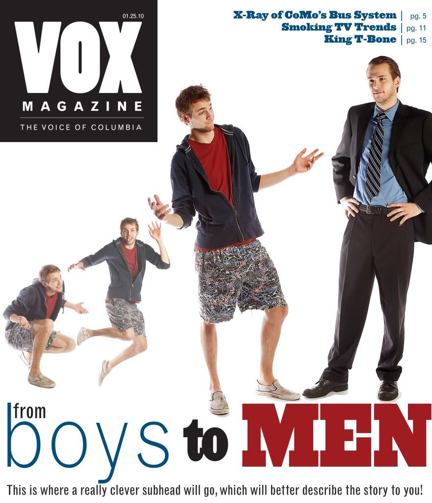
In the end, I admittingly "settled" with doing cutouts of the photo shoot, which ironically turned out to be what immediately disqualified my designs in the VOX cover/feature competition. Who knew people disliked cheesiness as much as I do? I will forever trust my instincts when it comes to overly-dramatic models... in design & life in general.

Assignment #1, cover prototype


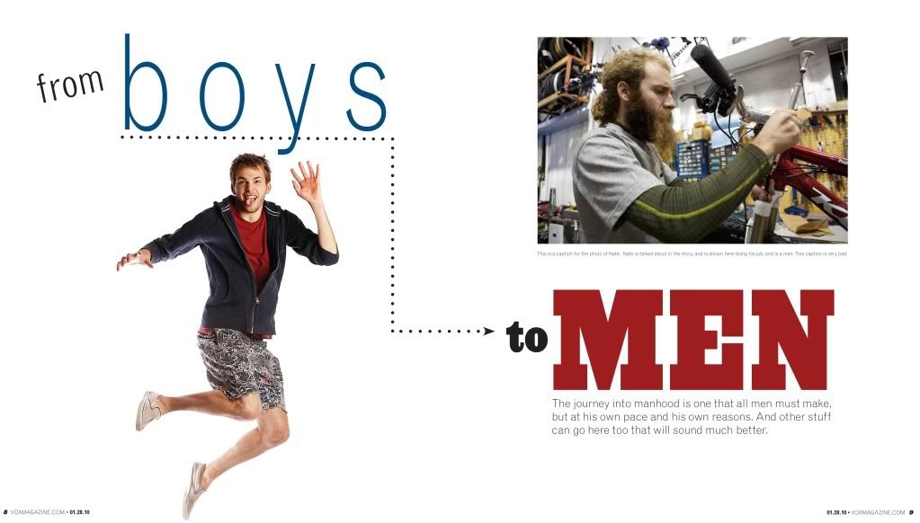
Assignment #1, feature prototype (pt. 1)


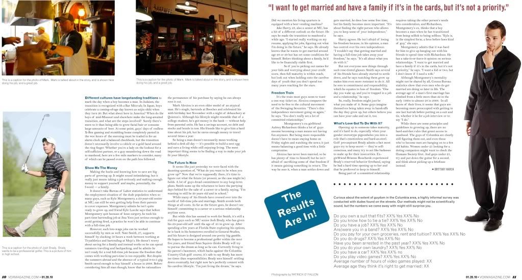
Assignment #1, feature prototype (pt. 2)

In response to these designs, I would have to agree with the criticism that I received: aside from using the cheesy model (ugh), there is a lot of white space.  And while I'm typically a bigger fan of white space than most, I do think that I err on the side of boring this time around.  I also see where the use of the model opposite a real character in the story (in the opening spread, aka, pt. 1) would be distracting.  Yeah, it didn't really work out like I had originally thought.

I do, however, like pt. 2 of my design, and find the overall look to be clean and representative of the story.

Designs to come: 

Our "Spring Preview" prototypes are due tomorrow in lab.  I look forward to getting feedback on this assignment, as the theme called for a bit more energy.  Hint: that color I was just talking about is making a (huge) appearance.

Until then, my critique is complete. Take care!
- Cassie May

Welcome!

Hi friends!

I thought I'd begin with a brief introduction, which will (hopefully) give you better insight on where I currently stand in this world of design. I've always loved being creative - really, it's the only thing that has the ability to hold my attention for longer than 10 minutes.  Whether it's designing pages for magazines, writing, scrapbooking, shopping, or even pretending I know how to cook... I love it all.  That said, when it comes to design, I'm still a newbie.  Actually, up until around September of last year, I was on the path to becoming a magazine writer.  Again, I just wanted to create.

Thennn, I took my first design class, fumbled my way through foreign, mind-boggling technology (thank you Jan & Adobe), obsessed over typography and color choices on my computer, and discovered a genuine passion for the industry. And while I still feel as though I have no idea what I'm doing - despite recent hours spent watching two-minute "how to" videos via Lynda.com - I still can't help but appreciate (and love) the fact that I know I'll learn something new every single day... even when I think I'm getting good.

So here I am: in the advanced design capstone and ready to fumble my way through this crazy world. I'm definitely not under the impression that it'll be easy - or anything close - but I'm up for the challenge :)

- Cassie May