2.24.2010

You Cannot Miss This: Creativity at its finest

The beauty of design is the creativity that goes along with it.  Without a creative heart and mind, it'd be impossible to, well... create.  And, it is for the love of the art that I post this "eclectic" mix of all that inspires Cassie:

I wanted to start by giving you my favorite quote.  I only found it recently, but it really resonates with me... especially when I get frustrated with life:
"The creative is the place where no one else has ever been.  You have to leave the city of your comfort and go into the wilderness of your intuition.  What you'll discover will be wonderful.  What you'll discover is yourself." - Alan Alda
(Ah...I think it's perfect.)

Okay, moving on. So I was browsing the web, and found this video of random people. You really must see this... if only just a little:


I mean, how much more "creative" can you get? I'm constantly baffled by human thought. There literally are no limitations. I must, must keep this in mind more often.

Annnnd lastly, I leave you with a quirky band promo flyer (I think) that I randomly found. It's innovative, yet a bit obvious at the same time.  And it works. Oh, and the use of white space is flawless. 

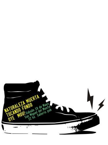
Photo credited to a new website I found: 

Okay friends, that's all I have for now. Take care, and I hope you have a very inspired day :)
- Cassie

In Response To: Portfolios, progress reports & Meredith designs

Due to a random case of the stomach flu (not fun), I was unable to attend our portfolio session in class on Tuesday. Thankfully, we have these wonderful blogs, and I fully intend to devote some time to seeing what my classmates have accomplished outside of class.  I'll be back with those comments soon!

Before my momentary absence, I was lucky enough to meet with Jan to discuss my progress to date.  She had really great things to say, which definitely helped encourage me into these next huge assignments.  Sometimes I do let myself get overwhelmed by my "newness" in the world of design, but it definitely motivates me to learn as much as I can in order to catch up.  That said, a major piece of advice that I'm taking with me for next few months is for me to work tirelessly to build up my portfolio.

On a different note, I am also currently working on (and am almost finished with) my Meredith prototypes! And aside from me being overly-critical right now, I'm confident in my designs! We all present to our groups tomorrow, and I am actually really excited for this part.  All of my designs are very content-driven, and I've been thinking my way through this whole (stressful) process.  So, regardless of whether or not my concept is chosen, I can sleep better at night knowing that I at least accomplished that.

Anyway, I'll be back soon with an update on my thoughts regarding my talented classmates' work and the results of the Meredith presentations!  Until then,
- Cassie

2.22.2010

Critique: 3 "Medieval" concepts

Last week, I designed three cover concepts for the 03.04.2010 "Medieval Warriors" feature.  These are the three (very rough draft) concepts that I presented in class on Thursday:
#1: Traditional Middle Ages
Concept: I wanted to go with the traditional view of the Middle Ages: bold, yet flat, colors, gothic type, and the decorative matt.  I found this one to be very "obvious", yet attention grabbing.

#2: Time Travel
Concept: Who are these people running around, reenacting a time period that existed over one hundred years ago, and why are they in Columbia? I wanted to ask the question that most people ask when they see these recreations, and do so in a modern way to show the contrasting time periods.  Also, it was important that I tie in the locality of it all.

#3: Dress Up
Concept: Lastly, I wanted to represent the juvenile stereotype that this organization, and others like it, have.  The article discusses this group's actions in depth, and exposes the truth behind the stereotypes placed on them. 

In the end, my concept #2 was chosen as the cover I should fully execute.  I agree with the decision, however, I do find it slightly humorous that the design chosen was the one that last popped in my head, and had the shortest amount of time devoted to it.  I love that.

Anyways, I will present the final draft of the design this thursday, and I'll be sure to keep you updated!

- Cassie

2.18.2010

You Cannot Miss This: Embracing the past

Once I started working on the historical perspective assignment, I couldn't help but think of how other "oldies" might provide influences.  Fortunately, colourlovers always seems to know what I'm thinking - it's perfect actually.

They recently did a post on David Weidman, an amazing designer/artist in the 50s & 60s.  In the following pictures, you'll notice his incredible sense of style, and fabulous color choices (that I LOVEEE.)


(Photos credited to David Weidman)

He really represents his time period, but does so in a way that is still somehow so relevant to today's society's fascination with vintage-chic. To read the full post about David Weidman by colorlouvers, go here, and for more of his work, go to his Flicker site here!

In Response To: Classic Vogue

Last week's assignment was to choose a magazine, a decade and to analyze its design and typography choices.  Naturally, I chose to go the furthest back in time and research Vogue in the 1930s.  Why? I was drawn to its classic elegance, visible development throughout the years, and the unstable nature of the world during that time period. (Check out my final presentation:)

All said and done, I admit that this was easily one of the most beneficial (and enjoyable) assignments I have had in college. Not only was it so interesting to research, but I also learned how to use resources (such as microfilms and really old magazines) as inspiration for my own designs.  Of course, that goes for all of the magazines my peers chose to do, as well; I loved seeing/learning about the different tones and voices of the other publications and compare how they differed from what I experienced with Vogue.

Honestly, I really feel that my time working on this project was more than well spent, and I appreciate that.

- Cassie

Critique: Short Talk & Medieval fun fun fun

This past week was my first department design, and honestly, it was a lot more difficult than I had expected.

As a front-of-book department, there are a lot of ads and reoccurring sections that go into the pages.  That said, with all ad space accounted for, I was left only one page for a primary with a sidebar, a secondary and photos for both.  This caused serious issues.

First of all, the secondary, the chili cook-off story, didn't take place until Saturday, and the quick turn-around was, well... not so quick.  Another problem was that the primary was a lot longer than expected, as well as its accompanying sidebar.

That said, with the help of Elise, we were able to make it work.  Really, when it comes down to department pages, there will always be the chance of spacial issues; thankfully, I learned early enough in the semester that the only way to solve those problems is to problem solve and think logically about the situation.  Rather than stressing out about missing images and text, it's always best to rationalize and reevaluate.  And after five hours sitting in the VOX office on Valentines Day, the lesson was well learned.

(I will post the final result of that department page shortly!)

On a different note, I am currently working on the three cover concepts for the medieval warriors story, and wow, this story is strange... in the best way possible. Here's a video clip for a better sense of where I'm coming from.
(Note: These are not the people from the story I'm working with, just the same organization!)


I mean, because it's about this foreign world to me, I find myself getting so distracted by everything I read/see about them.  Still, it's an awesome story to be thinking conceptually about, and I'm really excited about the possibilities.  Of course, due to the nature of this class, I won't post those ideas until after I present them tomorrow :)

2.10.2010

You Cannot Miss This: Katie Daisy

Still on a typographic note... here's to self-illustrated typography.

Yesterday, post-Helvetica watch party, I, being my newly-inspired self, opened up my HOW magazine only to find a feature on: you guessed it... typography.

But, not just any typography.  This was about letting go of all things formatted, and doing it yourself.

Accompanying the article, they also profiled six different illustrators/typographers.  Of them all, my favorite had to be a woman named Katie Daisy.  She has such a distinct, yet incredibly talented gift - one in which I have already received so much inspiration from. Here are a few of her pieces:
  

**All photo/illustrations credited to Katie Daisy. And for more, check out her site here: KatieDaisy.com**


On a different note, (yet kind-of the same)...
ColourLovers did a really great blog the other day, which featured some vintage-esque frames in really interesting color varieties. I love the tones on the frames, which I think have the same type of feel as Katie Daisy's work does.
Photo credited to colourlovers.com

Check out more of the frames/examples here: Colourlovers: Eclectic Color Roundup

In all, I've come to realize just how ready I am to find my niche.  You know, something that I'm reallllly good at. And even if not specifically within magazine design, at least just in my creativity at the core.  I'd love to have a wide-range of ideas and talents to help guide my layouts, but I also can't help but crave that ability to do that one thing better than I could have ever thought possible.

Hmm...press on, we must!!
- Cassie

In Response to: Just my type

Tricky play on words, I know. So in order to clarify, this is a response to the movie we watched in class yesterday: Helvetica.

Based solely on the font itself, Helvetica gives the history of Helvetica, as well as its present and the future.

To be honest, I've never been one to care much about font.  At least not in any sort of intellectual way.  Instead, I liked what was pretty and looked good on paper, and nothing else really came into consideration.  Of course, a lot changed once Jan came into my life and I was forced to re-evaluate the choices I was making... but I don't think the intensity of typography really settled into my head until I watched this movie.

And aside from that previous paragraph being a bit dramatic, it's true.  After the movie, I went through my magazine collection and design pages online, and realized a whole new world that I love... and it's full of letters.

In this discovery, I know that I will now have a much better appreciation, and deeper consideration, for the typography I see and use. It's a deeper thought process than before, and I'm really excited about it... in a really geeky kind of way.

On a final note... which team did I side with in the movie: Team Helvetica or Team-anything-but? That's easy:

I'm "Anything but."

And I understand appreciating the clarity that Helvetica provides, but let's be honest: I'm not a suit and tie kind-of-girl.  I don't like straight-edged, and I definitely reject all things formulated, expected and routine.

For me, Helvetica is a prime example of over-simplifying life. Nothing needs to be that easy - as easy as the Team-H people in the movie praise the type for being.  "Easy" is unrewarding and stupefies.

Give me an original thought instead - regardless of whether it is hand-drawn, slightly illegible or not. If it is able to completely express an emotion, idea or concept... it's better than any clean, unexpressive "thought" any day.

-Cassie

Critique: Rawrrr...my first feature

The first time I read the feature story that I was to design, I couldn't help but ignore the fact that it was about mountain lions. Instead, the tone of the story lead my scattered brain to exaggeratted fables... and trashy tabloids. And I mean that it the nicest of ways, I swear.

It wasn't that the story was necessarily poorly written or anything - it was actually really good. Instead,  it simply had a very distinct "Bigfoot-esque" tone.  Eventually, as hard as I tried to divert those initial thoughts (for the sake of generating a wider range of ideas), when it came down to finally prescribing a concept for the design, I had to do what I was thinking of all along. 


There are a few things that are different than what will run in tomorrow's magazine, but for the most part, this is it... and I love it. I worked for a long time on making it as close to the concept as possible, and I think it makes sense.  I also really appreciate the help that Aimee provided to me on this one.  Not only was there a lot of encouragement (which I needed) to run with the tabloid idea, but also great suggestions that I think only enhanced the final result. (I'll post the updated version as soon as I can.)

In the future, I want to continue on strengthening my ability to produce content-driven work, because in the end, it's what I am always the most proud of. 

- Cassie

2.03.2010

In Response To: Your mind & mine

This class revolves around ideas. For each task, we are given the same central theme, and are then expected to create.

Create, create, create.  

And while this may seem pretty standard, I can't help but wonder how not one of our designs ever seems to come anywhere close to another. After all, for the most part, we hear the same things, and see the same things, yet nothing that we do is ever really the same.

For this recent Spring Preview assignment, for example, Kelly's cover design featured a rain boot, while Jessi's had a playful groundhog.  Obviously no resemblance there.  And as big of a role that flowers and nature play in Spring, none of the flowers, or rain for that matter, could be mistaken for another. All of my classmates, including myself, went in very different directions in terms of how to create Spring on a magazine cover. Sure, there were similar objects, but the visual presentation was always different.

The point? I suppose it's in support of the concept that there are a million possibilities for any one idea. Whereas I may not have bought into it before this course, I am now convinced.  And it's encouraging, especially as we take on this next task:

We are to design a logo for a country music star on-the-rise.  And while country music isn't really my "thing," I can appreciate the art, as well as this assignment.  It also doesn't hurt that after our class' "conference call" with her yesterday afternoon (aka, us sitting in a classroom staring at a speaker box while listening to her make her way through Hollywood traffic), I found myself relating to a lot about her personality. Now, with three pages of scribbled notes all about this artist to scan for ideas, and the encouraged mindset of limitless possibilities, I am eager to begin drafting the 20 different options for this logo.

...That's right, each of us are to design 20.  I'll keep you posted on how it goes.

- Cassie

Critique: Spring Preview review

After struggling with the "Boys to Men" story, this last assignment was a much needed breath of fresh air. Pun intended.

The process of deciding what to do for the cover was an interesting one... to say the least. There were too many ideas running through my head, which resulted in me stalking my roommates.  I forced them to play a game with me: to say the first five things they thought of when they thought of Spring. I thought this was a brilliant idea -- that this would at least narrow down my ideas to a single concept. No. Instead, I got: 

- Bunnies
- Rainbows
- St. Patrick's Day
- Bunnies
- Easter
- Family 
- Bunnies

Apparently my roommates had memorable Easter egg hunts when they were kids. Nothing I wanted to use. 

Back at square one, I wrote down a list of everything running through my head (no bunnies), and the most reoccurring theme was "April showers bring May flowers." And, about an hour later, the rain somehow turned into blue stripes met by white dots as the drops, and the flowers turned into loose swirls made by using the brush tool in illustrator. 

I was really happy with the way it turned out, and I later found out that it was actually picked to be published! This really surprised me after I had seen my classmates' designs - the other girls are so creative and talented, and I fell in love with some of their designs (especially Lauren's tree, Erica's wildflowers and Jessi's groundhog.) 

Anyway, I spent last weekend making some edits to the cover (the final product looks a bit different than what is shown), and it will be on stands tomorrow. In reflection, it was all such a cool, yet very unexpected, experience, and I really appreciate everybody's support.

As for my feature, I wanted to use the flower colors to separate each month's activities. I used the same color palette and this is what it ended up looking like:


The feature was not pick to be printed with my cover...and for good reason. It is a bit boxy on the left page, and I've really got to remember that too big of text never looks as good printed as it does on screen. By making the text smaller, I could have used more photos, which would have made some of the events more recognizable. 

That's all for now! Be back soon,
- Cassie

2.01.2010

You Cannot Miss This: Why so blue, green?

Photo credited to colourlovers.com/blog

Colourlovers.com is so successful because of its creative way of looking at things.  They recently did a post on the "timeless" trend in interior design of using blue & greens (specifically kelly green and navy), which they describe as a preppy combination. I totally agree.  When I look at the colors together, they do appear reminiscent of Polo and Lacoste clothing. And while that's not my style forte, I do appreciate the look's clean presentation. SO! In terms of design, kelly green, blue, and white, used in unison, can produce a very neat layout. 

Key word: can. But, not always... and that's not a bad thing.  After all, just as most things in life, blue, green and white can also get a little wild and unpredictable.  

Photo credited to WaryMeyers.com

In this particular room, (which I find to be visually stimulating and ideal for my future homestead), the teal-blue wall and green couch work to bring balance to an extremely eclectic room.  The underlying lesson here is that you can make chaos work, as long as you balance the amounts in an effective way. The large blocks of blue/green color pull together the mass amounts of activity found in the artwork and throw pillows.

(Other unique room designs, with a ton of cool palettes, can be found here. It's a personal interior design site of a few people who love to take creative chances with color and patterns. Oh, and beware... there are some pretty awful designs too, where controlled chaos turns not-so-controlled.)

How do I apply this to journalistic design? This room inspires me to take chances.  A lot of times, I design with the fear of going overboard--of doing something too abstract.  Instead, I should trust my instincts on colors and patterns. After all, going too clean and controlled gets boring if done too often, or done when not appropriate.